Ink
Letters, the large circle, all text. A warm black, never #000.
- Hex
- #1D1B17
- RGB
- 29 27 23
- CMYK
- 30 35 45 95
- Pantone
- Neutral Black C




Small steps.Big moves.
One idea, and the few tools that carry it: a wordmark, four colours, one typeface and a dot.

Chapter 01
Small steps. Big moves. An entire company, started with one press.
The small step is literal: you press start, and an operating system, its hardware and a five-agent team go to work. The symbol tells the same story in two shapes, read in order.
Fig. 1.1
A small step.
Fig. 1.2
It moves.
Fig. 1.3
Something big follows.
Fig. 1.4
The big one makes room. That shape is the symbol, and the O in POCKET.
Chapter 02
One wordmark. The symbol does not sit beside the name; it is the O inside it.

Fig. 2.1 · Primary logo
Three lines, one size, flush left: THE / P●CKET / COMPANY. The default for square and upright formats: covers, posters, packaging and profile images.
Fig. 2.2
Primary
Square and upright formats. Use it whenever it fits.
Fig. 2.3
One-line
Wide, short spaces: website header and footer, signs, the roof of the machine, email signatures.
Fig. 2.4
Symbol
When the name is already nearby or the space is tiny: app icon, favicon, avatar, embroidery, deboss.
The logotype is outlined artwork, not typed text. Every measure is a share of H, the height of the capitals. Anyone redrawing it for a sign, a stitch or a carving checks the result against these numbers.
Fig. 2.5
Stems and bars. Stems are 0.34 H. Bars are thinner, 0.24 to 0.28 H, so they look just as heavy.
Fig. 2.6
Overshoot. Round letters are drawn taller to look the same size: C and O by 4.6%, the symbol by 6.8%.
Fig. 2.7
Below the line. The dot hangs 0.07 H under the baseline, the only part of the name that leaves it.
Measured box to box, no two gaps match: from −0.08 H, where the A tucks under the P, to 0.13 H between two straight stems. What is even is the white between the letters. Never track, kern or justify the logotype; place the master file.
Clear space
Keep a margin of X on every side. X is the height of the capitals. Nothing enters it: no text, no edges, no other logos.
Minimum size
Primary
80 px on screen · 20 mm in print
One-line
140 px on screen · 36 mm in print
Symbol
16 px on screen · 4 mm in print

Fig. 2.8
Reversed logo on Cobalt silk.
The logo sits on the calmest, darkest part of the fabric, away from the folds and the light. Paper letters, Ember dot.
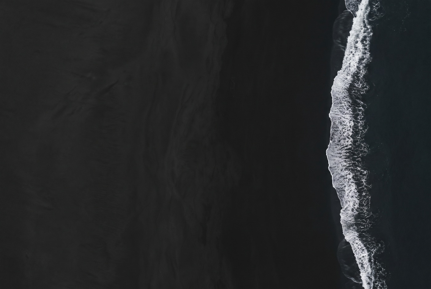
Fig. 2.9
Paper on black sand.

Fig. 2.10
Ink on a sunlit wall.
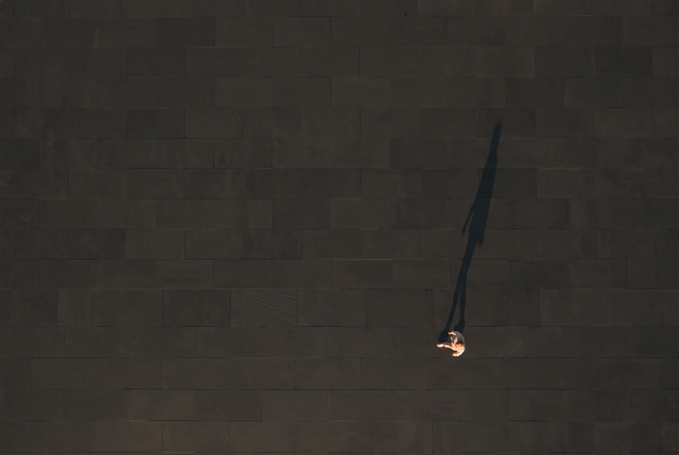
Fig. 2.11
Paper on a dark aerial.

Fig. 2.12
Paper on deep blue.
Pick the version from what sits behind the logo. If none of these fit, change the background or the crop, never the logo.
01On Ember
✓One colour, Paper.
✕Full colour: the dot disappears.
02On light tints
✓Ink letters, Ember dot.
✕Paper letters: too faint to read.
03On Cobalt
✓Paper letters, Ember dot.
✕Ember letters: the colours fight.
04On a busy picture

✓On the calm, dark part.
✕Across faces and detail.
05On a light picture
✓Ink on a light picture.
✕Paper on a light picture.
06Across two colours
✓Inside one colour field.
✕Across the edge of two.
Pick the version from the shape and the size of the space: one-line for wide, the stack for square and tall, the symbol when it gets small or round.
01Wide formats
✓Wide: the one-line logo.
✕The stack squeezed into a strip.
02Tall formats
✓Tall: the stack, top left.
✕Never turned on its side.
03Round crops
✓Avatars: the symbol, centred.
✕The name cut by the circle.
04Small sizes
✓Under 80 px: the symbol.
✕A full logo too small to read.
05Large sizes
✓Signs keep clear space X.
✕Running into the edges.
06Next to partners
✓Same height, a rule between.
✕Crowded, mismatched sizes.
Chapter 03
Black and white first. One blue to collide with them. One dot. Shown at the proportions we use them.
Ink
Letters, the large circle, all text. A warm black, never #000.
Paper
The ground. Most of every layout. A warm white, never #FFF.
Cobalt
The one colour that collides with black and white. Large fields, never small accents.
Ember
The dot. On objects, the one detail you touch: a pull tab, a painted edge, a button.
Screen values are the reference. Cobalt is brighter than CMYK can print, so print it as the Pantone spot. Approve every print colour against a physical swatch, never against a monitor.
Paper and Ink carry almost everything. Cobalt is the single bright colour, used in big confident fields. Ember is never a background, never text.
For interface states and quiet surfaces only. They never appear in the logo and never replace the core four.
Neutrals
Ink 70
#57534A · secondary text
Ink 50
#8C867A · dividers, large captions
Stone
#E9E2D2 · panels, board
Paper 2
#F5F1E8 · cards on Paper
Interface states
Cobalt Deep
#000B9C · hover, pressed
Cobalt Soft
#8794FF · on Ink, 6.4 : 1
Ember Deep
#A8371A · a pressed dot
Chapter 04
One family, Montserrat. Black for big moves, Light for small steps.
A geometric sans by Julieta Ulanovsky. Free from Google Fonts under the SIL Open Font License.
Black for headlines, Light for leads, Regular for reading. The logotype is drawn artwork: never retype it.
ABCDEFGHIJKLMNOPQRSTUVWXYZ
abcdefghijklmnopqrstuvwxyz 0123456789 & → 24/7
Chapter 05
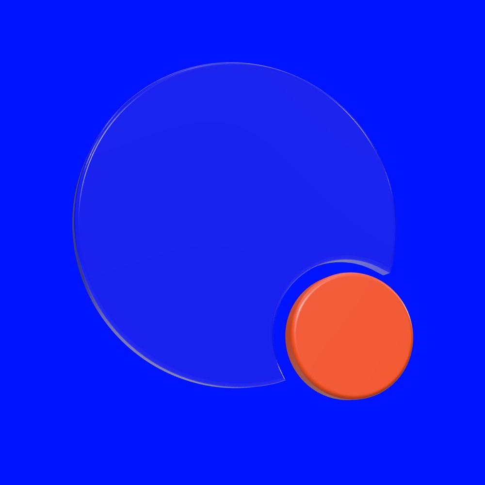
The symbol, scaled up, set in motion and built in three dimensions. That is the whole kit.
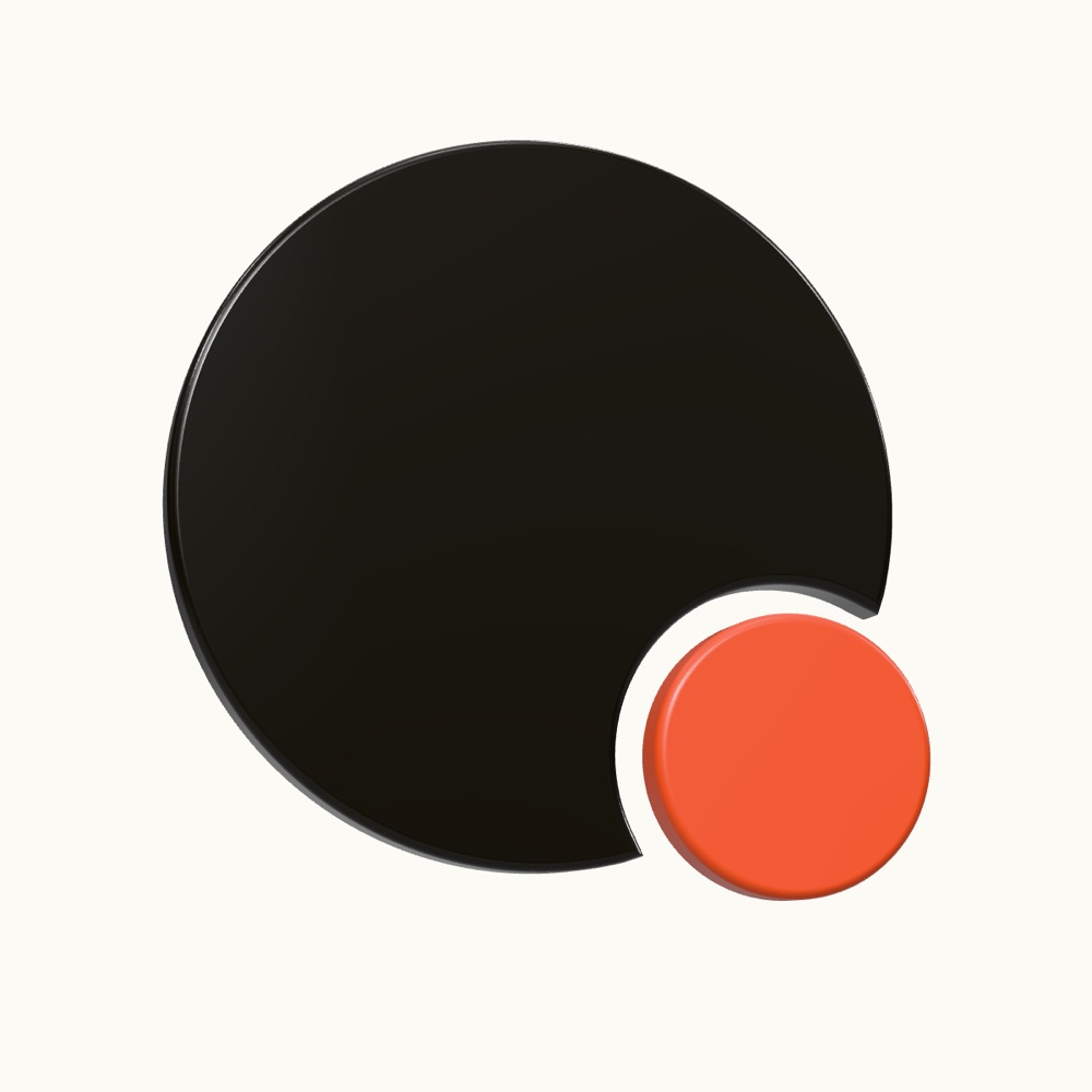
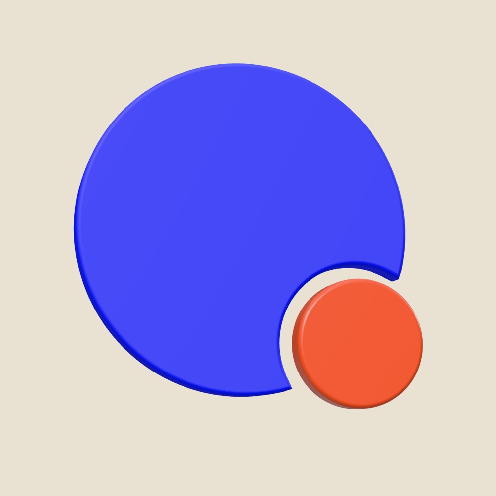
Fig. 5.1 · Paper on Cobalt
Fig. 5.2 · Paper on Ink
Fig. 5.3 · Cobalt on Paper
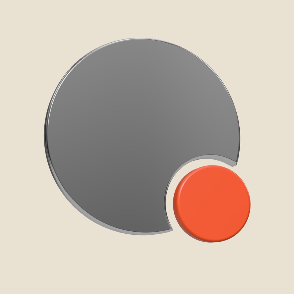
The big circle follows. Every animation retells the idea, from a button press to a billboard.
For film titles, product renders and screens. Six approved finishes, all from the same master geometry.


Chapter 06
Stone, paper, leather, light. Real materials, finished with one dot.
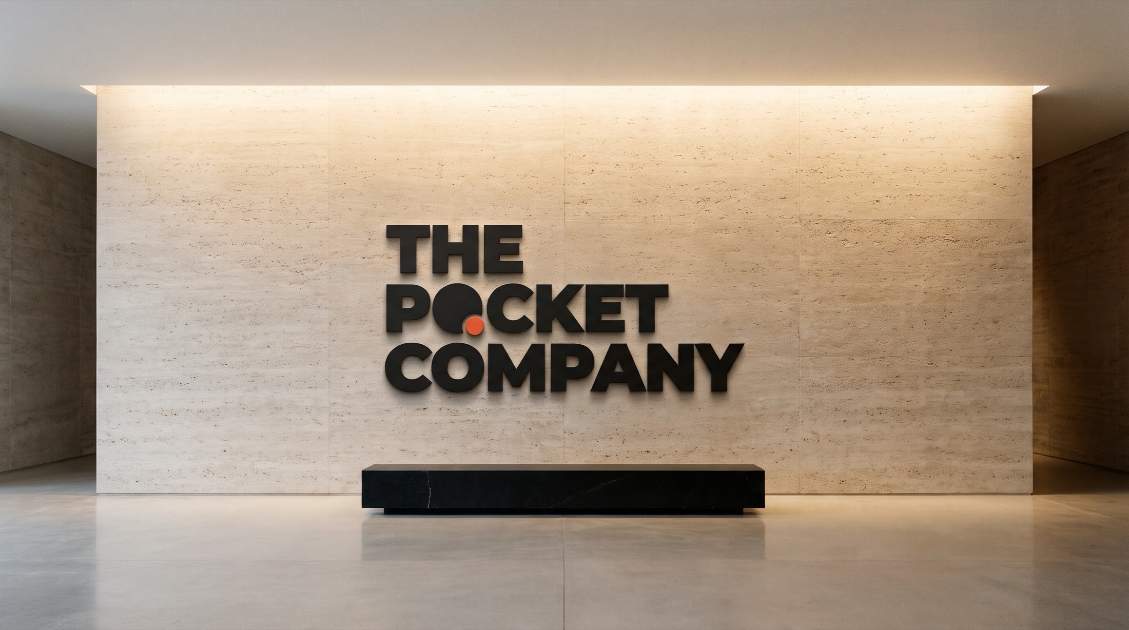
Fig. 6.0
Reception wall in travertine. Dimensional letters, an Ember disc for the dot.
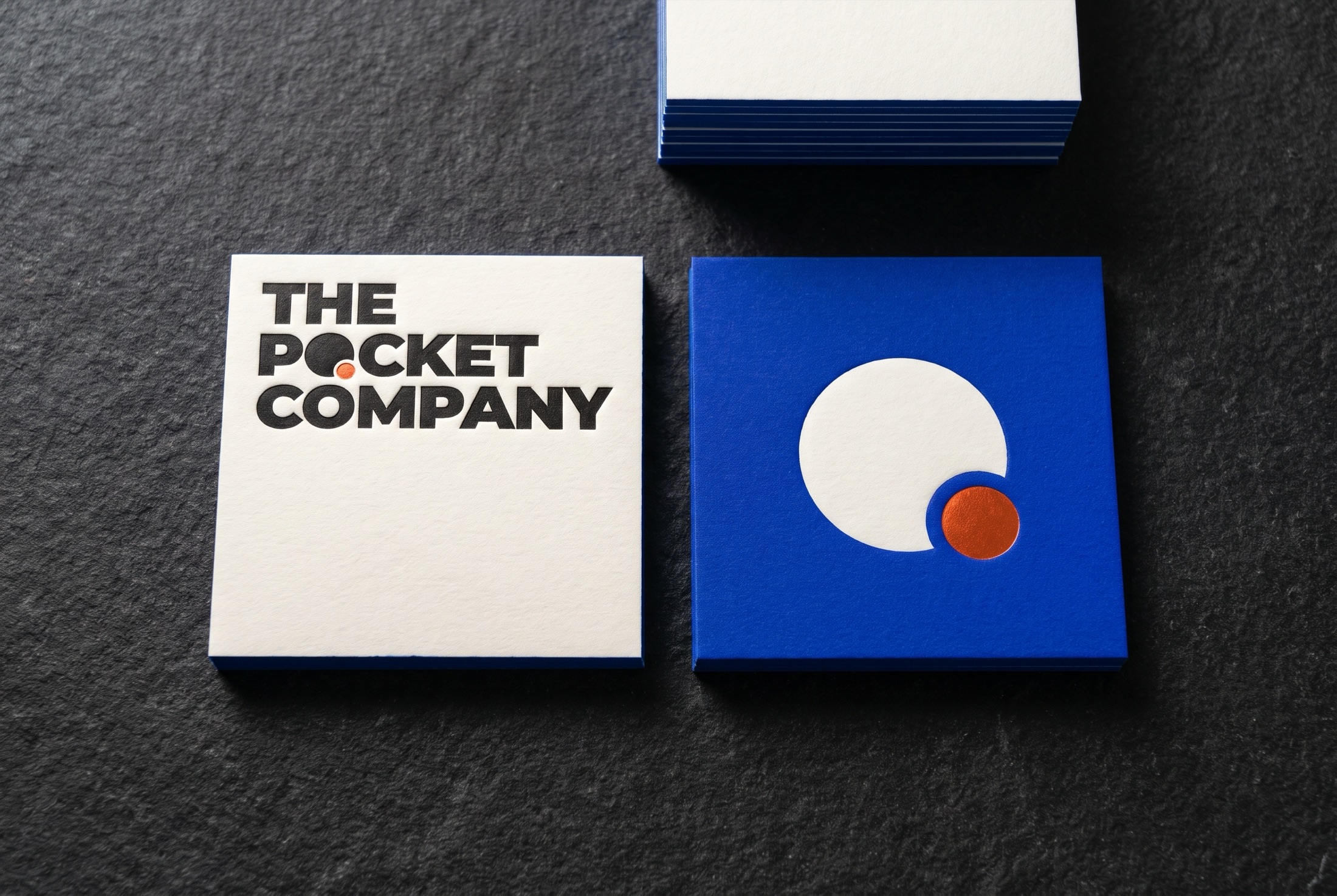
Fig. 6.1
Square letterpress cards with Cobalt painted edges.
Paper, linen and stone. The dot is the only colour, finished in Ember foil.
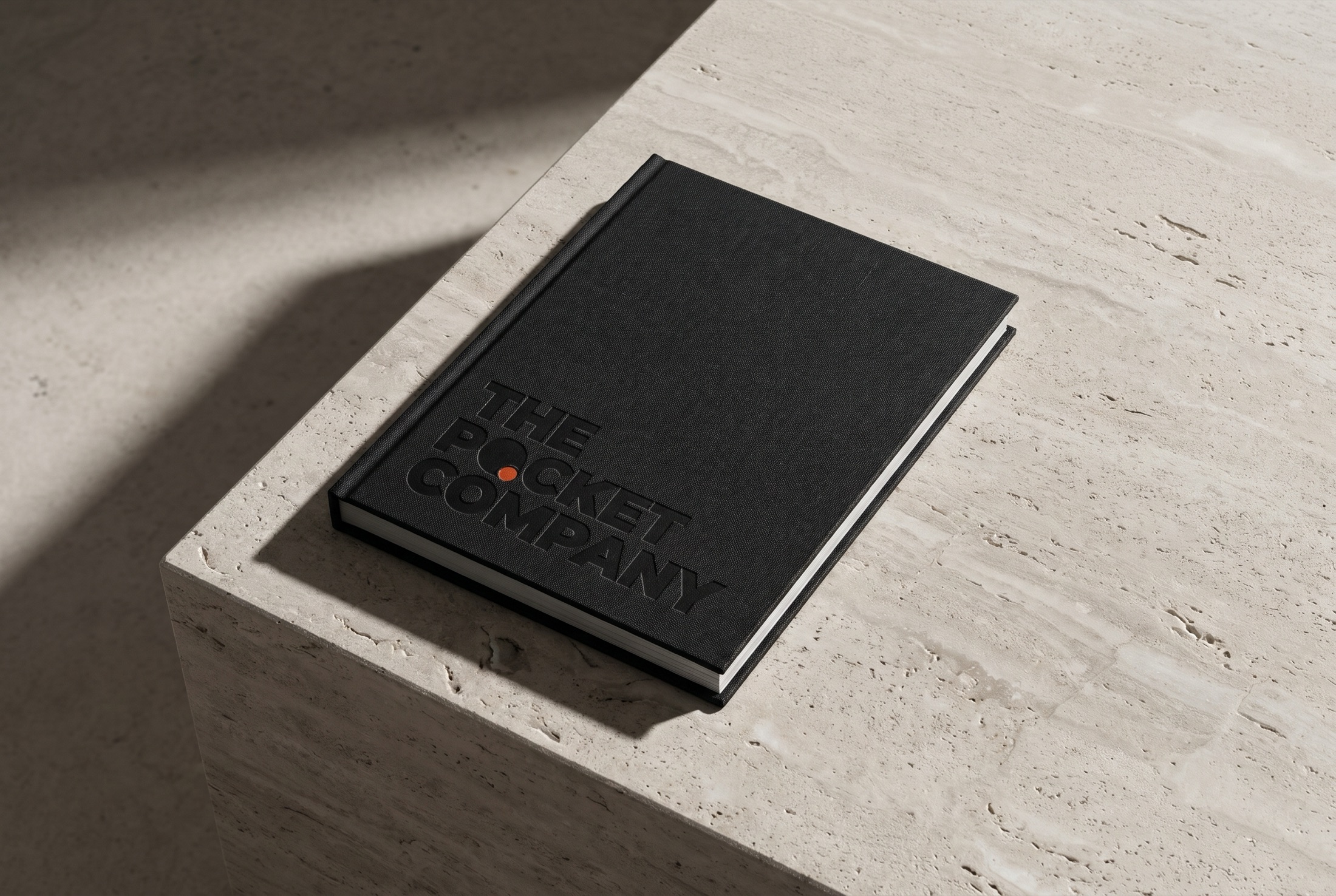
Fig. 6.2
The guidelines in black linen, blind deboss, Ember foil.
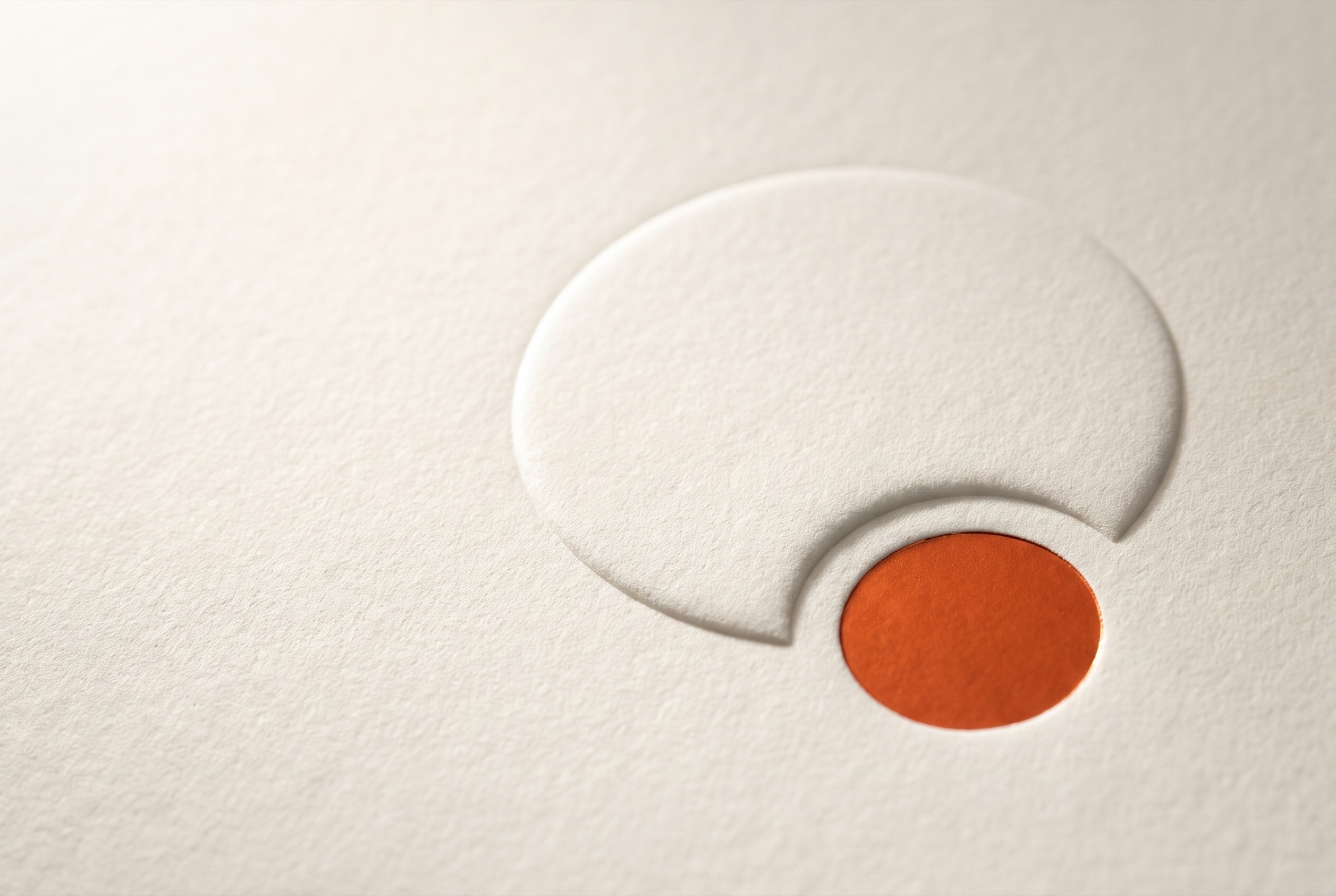
Fig. 6.3
The symbol blind-embossed on 700 gsm cotton.
Canvas, stoneware and cloth. The logo prints in Ink or Paper; the dot is the only colour.
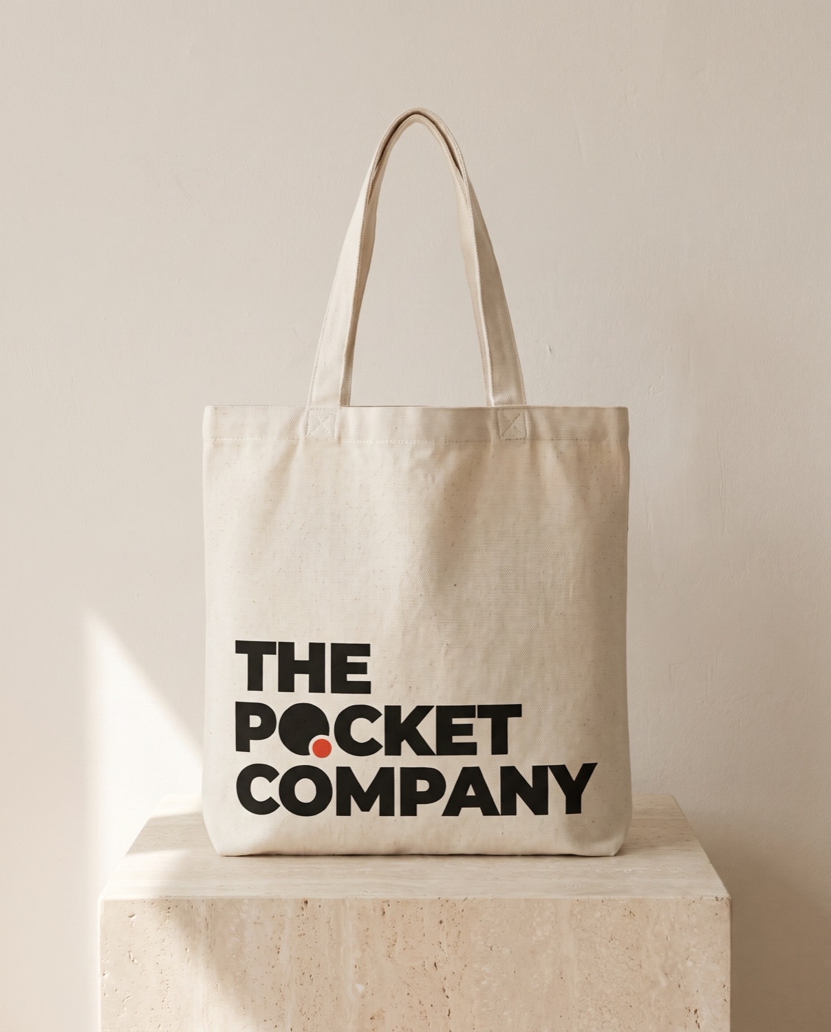
Fig. 6.4
Canvas tote. Primary logo, screen-printed in Ink.
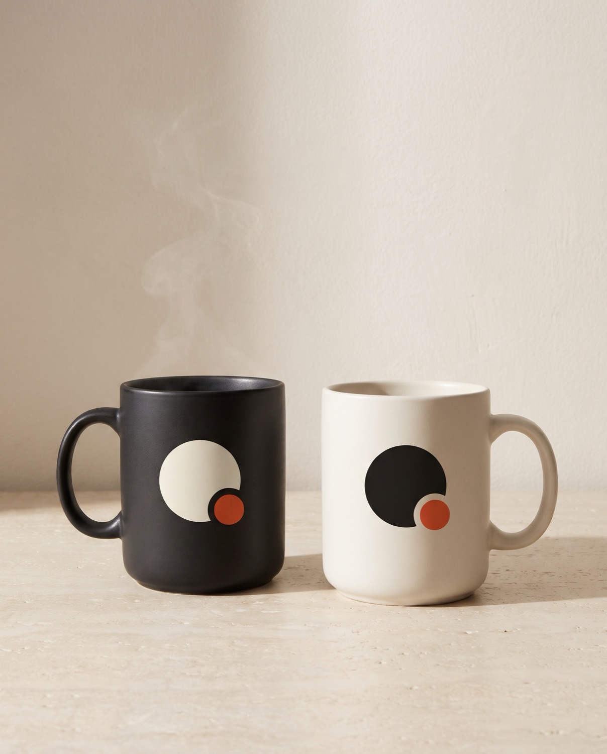
Fig. 6.5
Stoneware mugs. The symbol in Paper on Ink and in Ink on Paper.
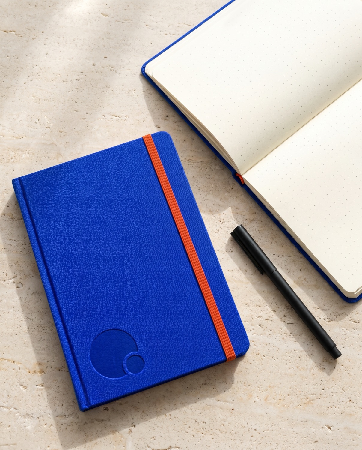
Fig. 6.6
Notebook in Cobalt cloth. Blind deboss, Ember elastic.
Where the brand gets small, use the symbol alone. The dot still lands in Ember, whole and never cropped.
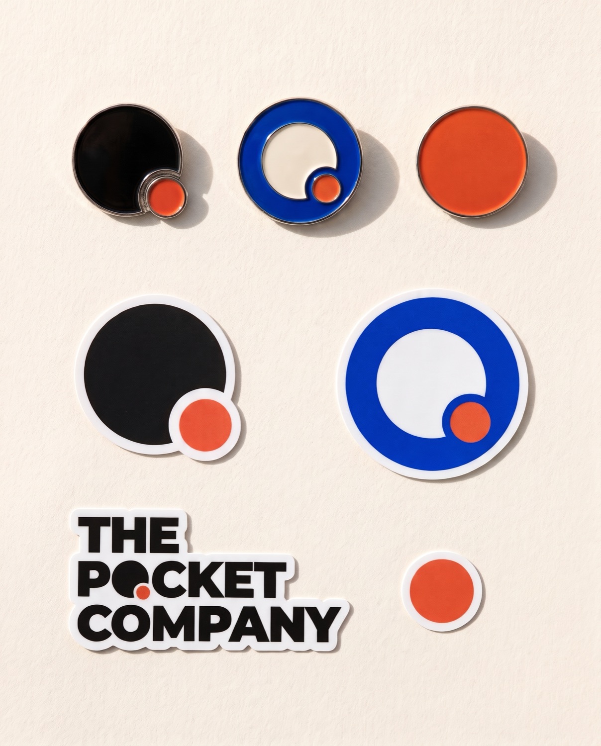
Fig. 6.7
Enamel pins and die-cut stickers.
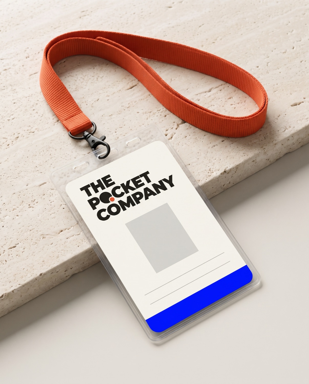
Fig. 6.8
Staff pass. Primary logo, Cobalt band, Ember lanyard.
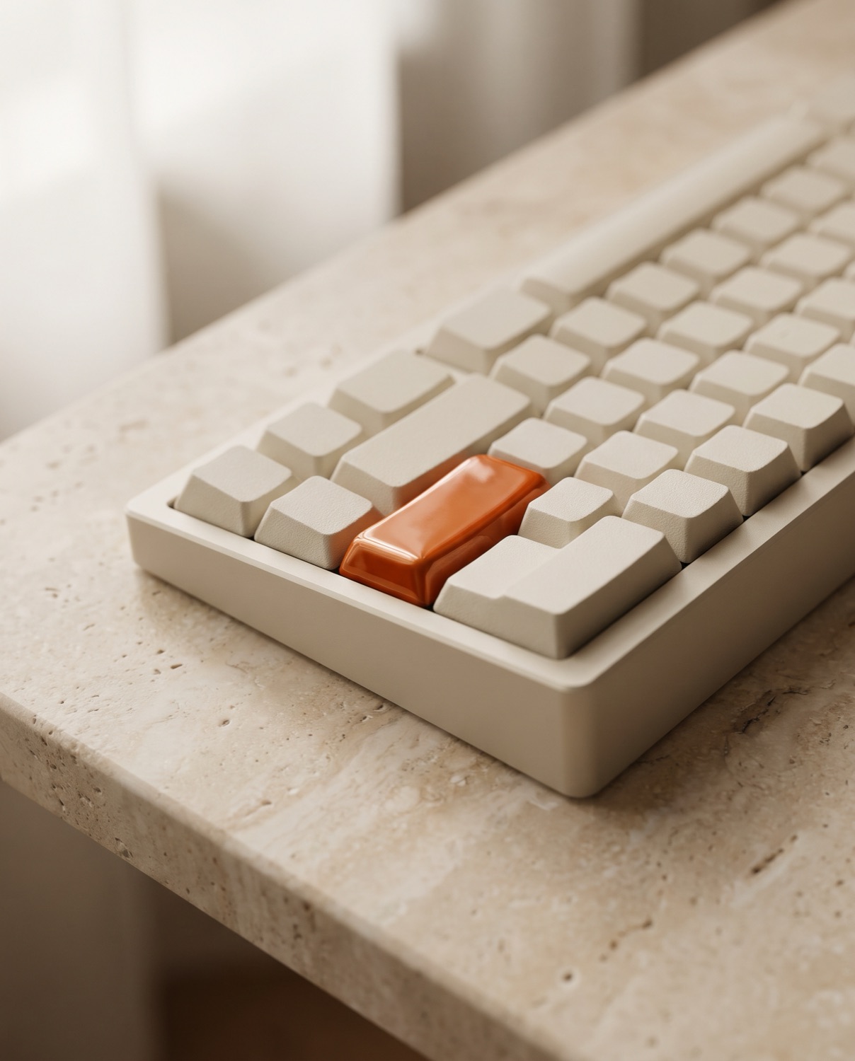
Fig. 6.9
One Ember key. Press start.
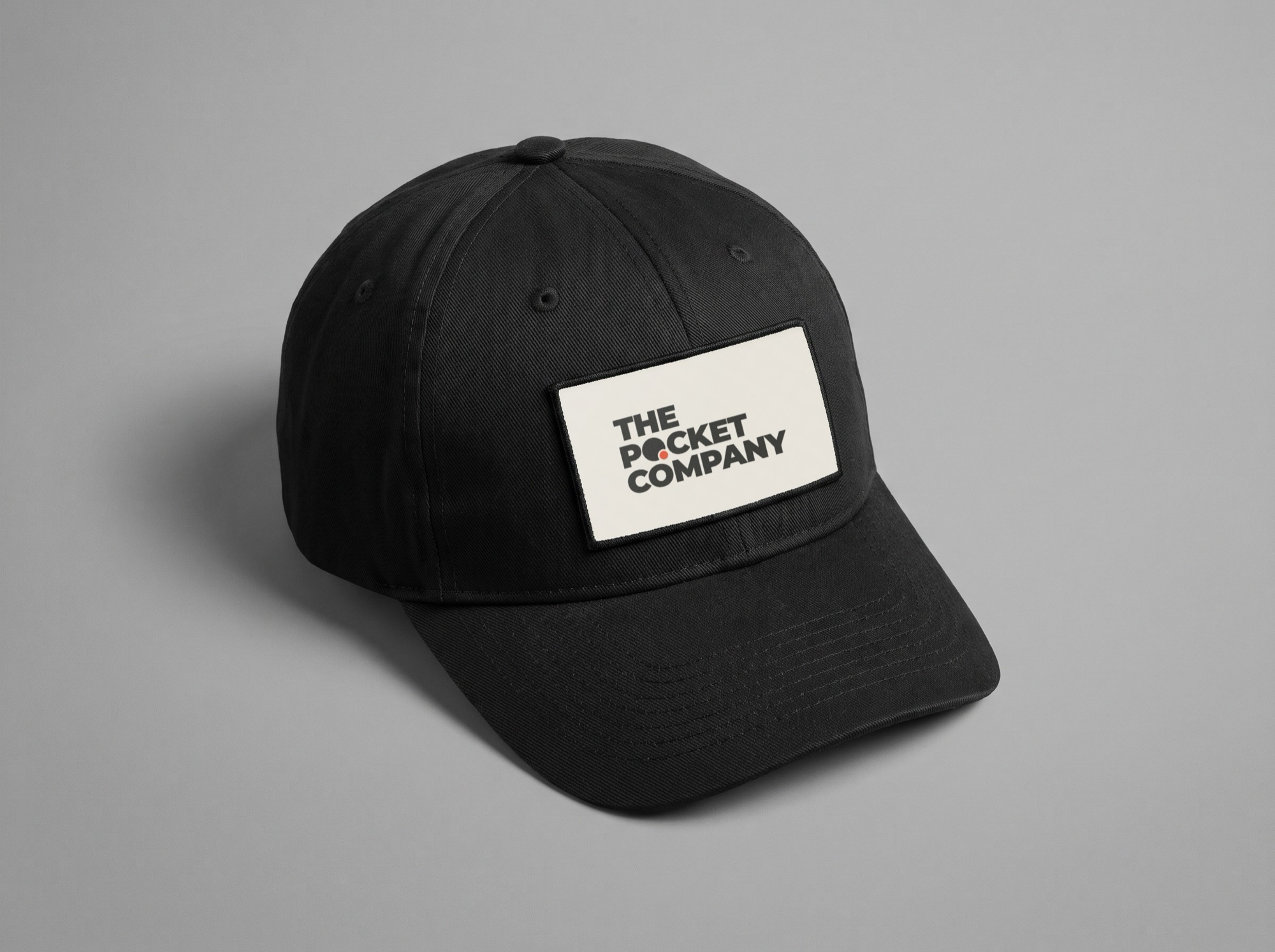
Fig. 6.10
Black cotton cap, woven label: Paper ground, Ink letters, Ember dot.
On caps and bags the logo goes on a woven label rather than straight onto the cloth, so the gap and the dot stay sharp. Use the stacked logo on the label. Below 30 mm wide, embroider the symbol alone.
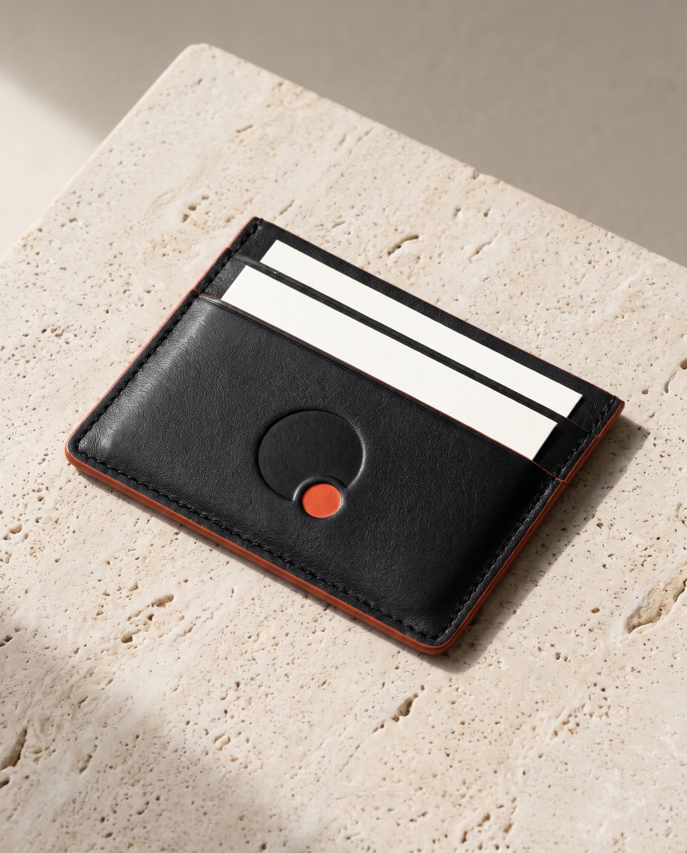
Fig. 6.11
Leather card holder. Debossed symbol, Ember dot and edge paint.
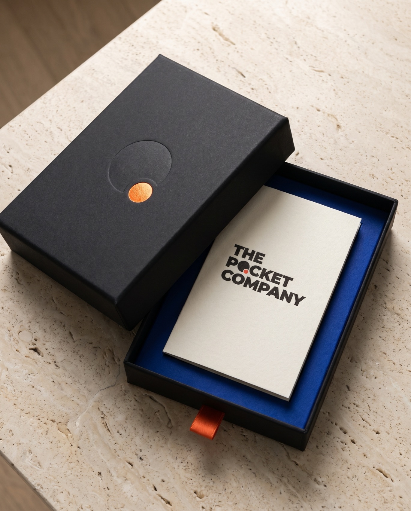
Fig. 6.12
Presentation box. Soft-touch Ink, Cobalt lining, Ember pull tab.
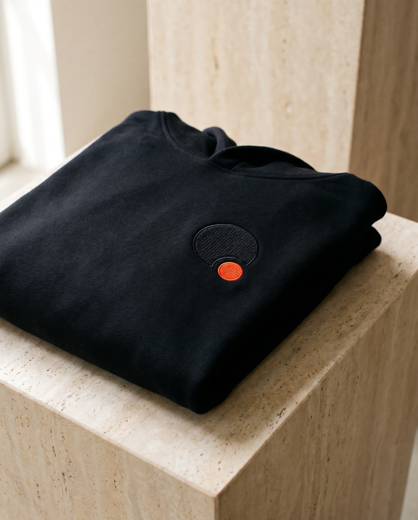
Fig. 6.13
Hoodie. The symbol tone on tone, one Ember stitch.
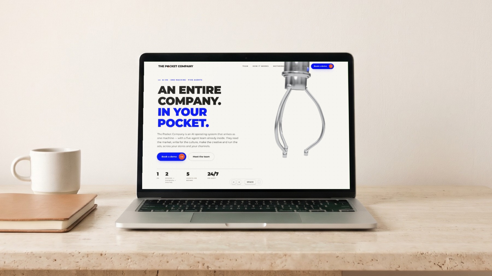
Fig. 6.14
The home page, live build.
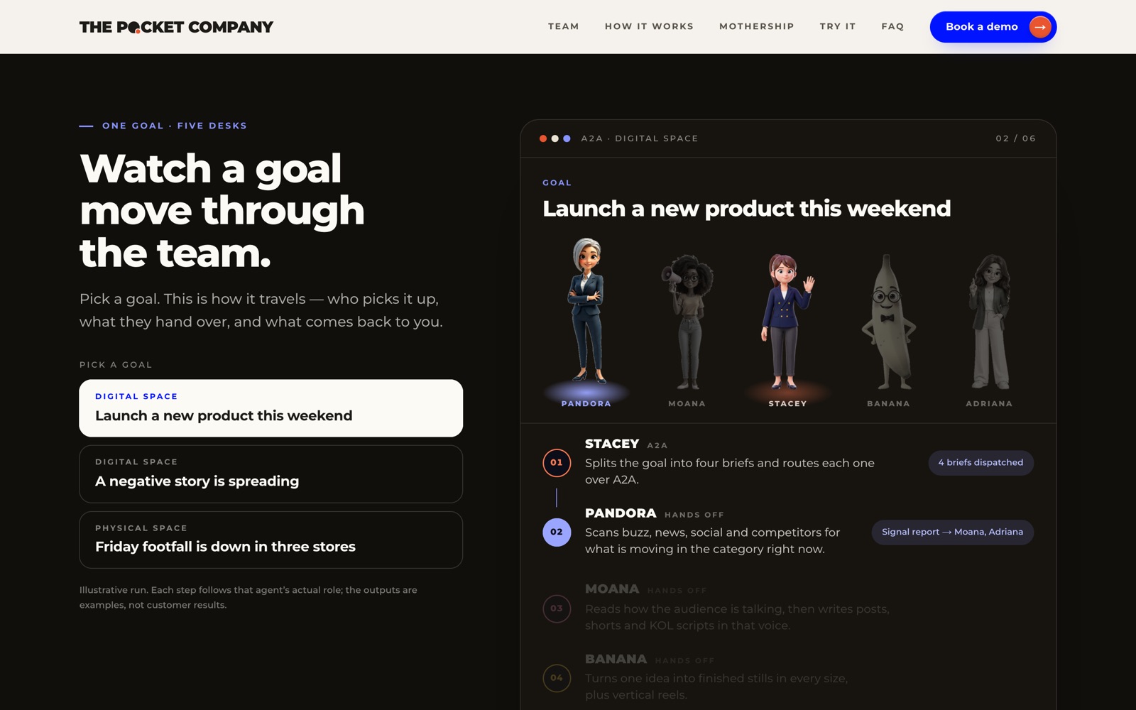
Fig. 6.15
How it works. A goal moves through the team.
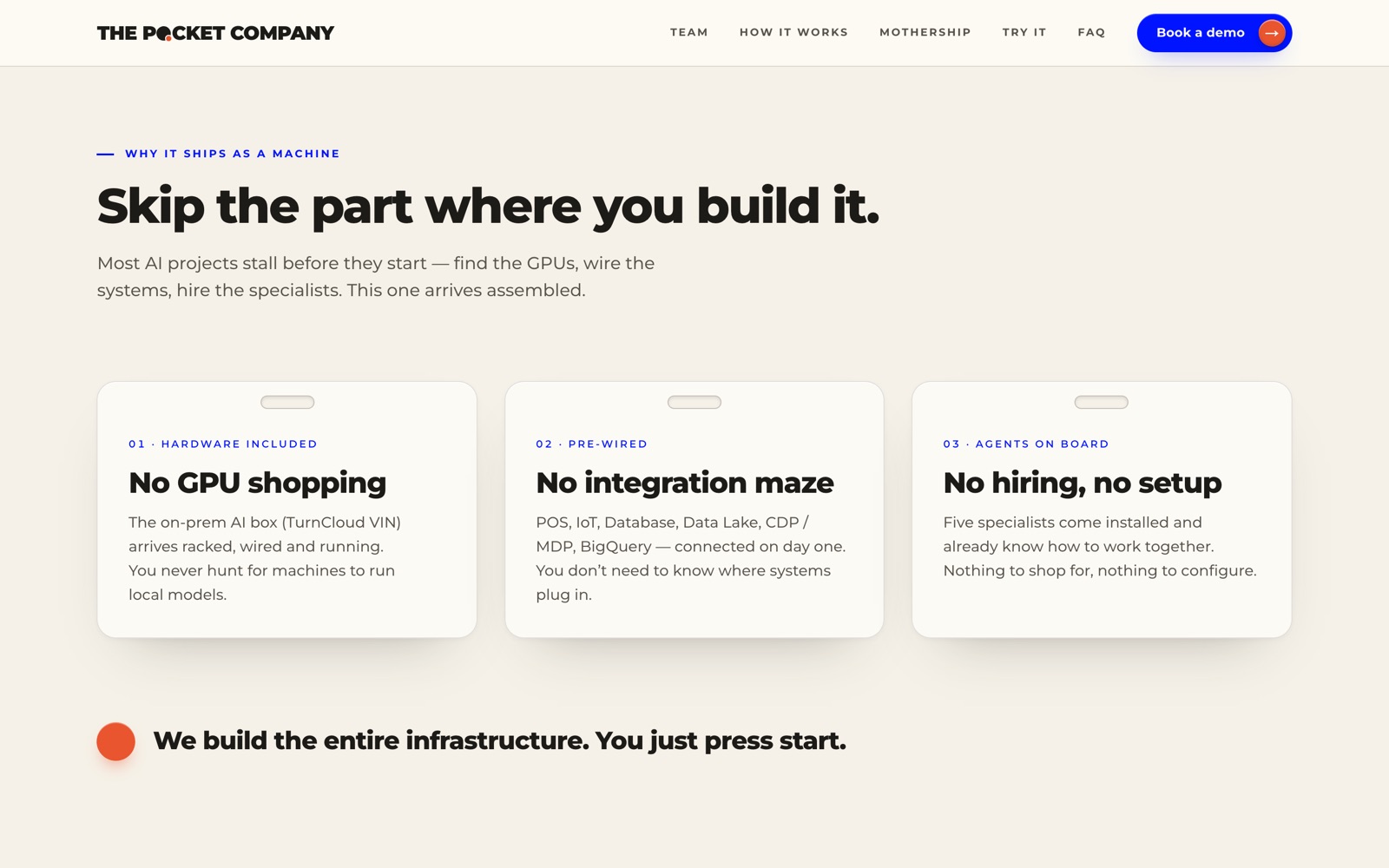
Fig. 6.16
Why a machine. Three things you skip.
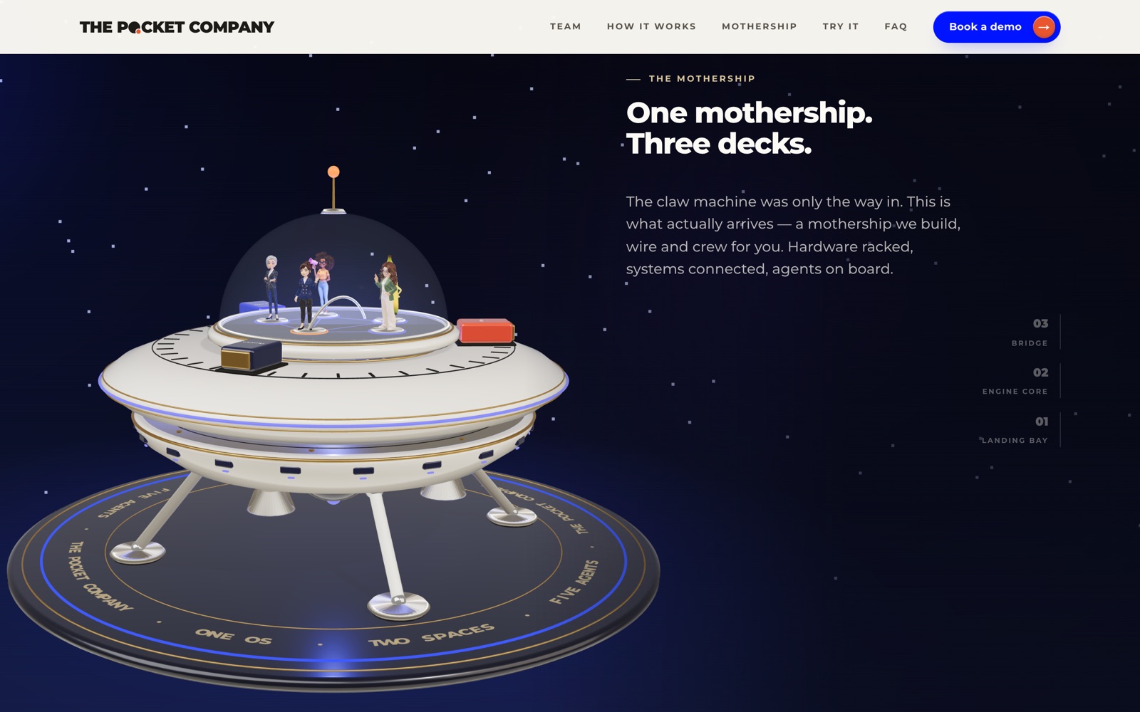
Fig. 6.17
The mothership. Three decks, one ship.
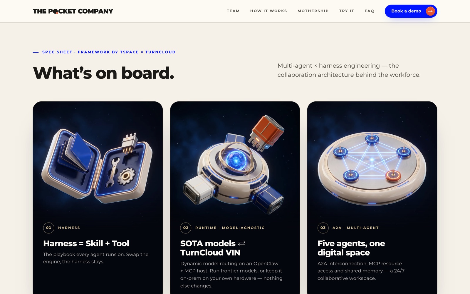
Fig. 6.18
Spec sheet. What is on board.
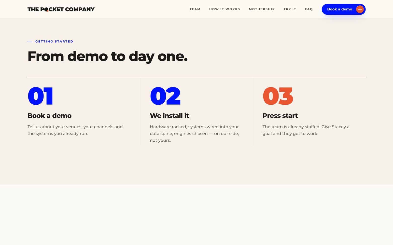
Fig. 6.19
Getting started. From demo to day one.
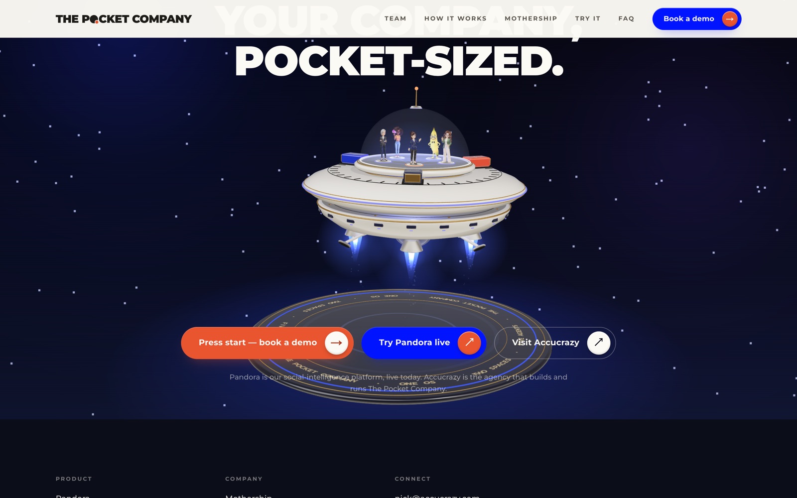
Fig. 6.20
Closing call to action. Press start.
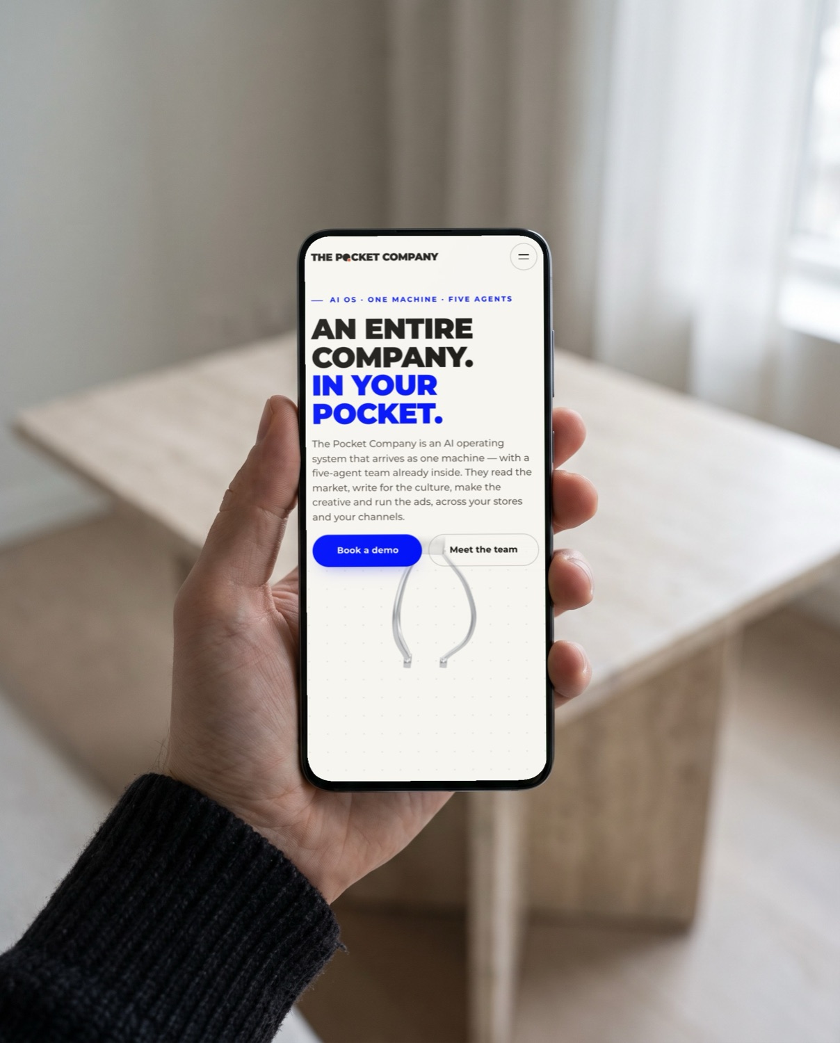
Fig. 6.21
Mobile home page.
One column, the same order as desktop. The logo stays one line; the menu folds into a single round button.
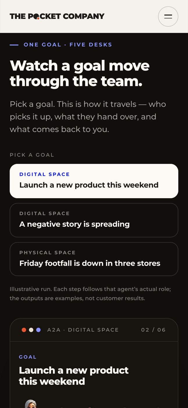
Fig. 6.22
How it works
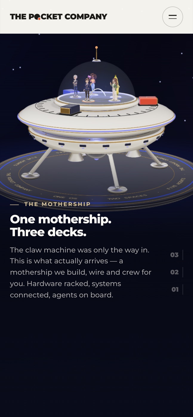
Fig. 6.23
The mothership
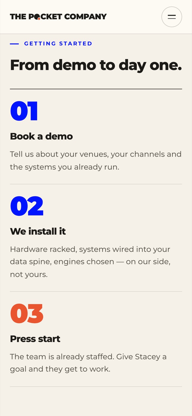
Fig. 6.24
Getting started
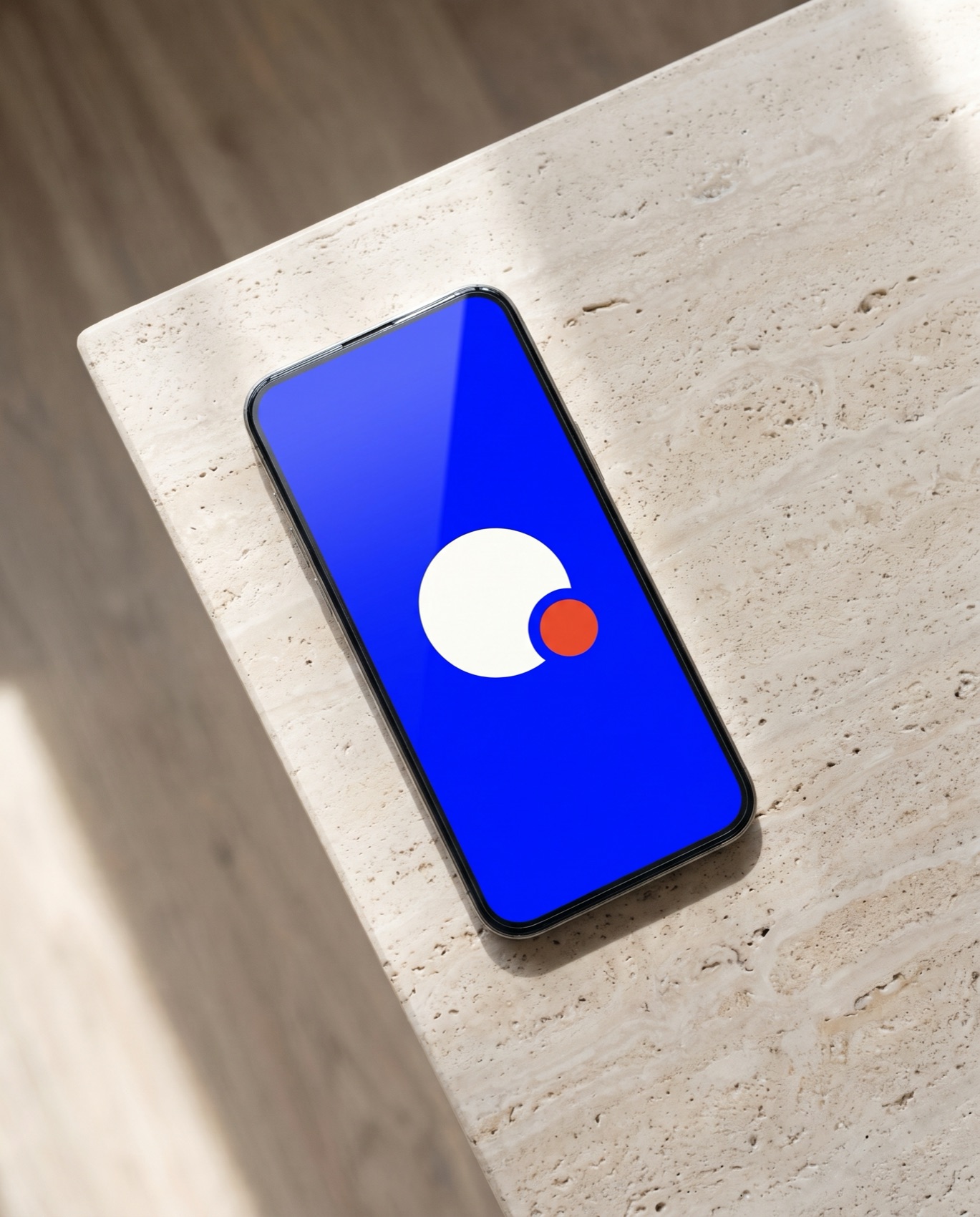
Fig. 6.25
App launch screen.
The launch screen is the symbol on Cobalt and nothing else. Icons use the symbol alone, on Paper, Ink or Cobalt.
App icon
Favicon
Favicon at 32 and 16 px: the symbol alone, never the wordmark.
Meet your AI workforce
Five hires.
Already a team.
On shift
24/7
Five agents. One machine. No days off.
Why it ships as a machine
We build the entire infrastructure. You just press start.
Profile image: the symbol on Cobalt, centred in the circle crop.
Film and photography are graded black and white. Every edit opens on the one-line logo in Paper, centred on the darkened frame, with the Ember dot as the only colour.
00:00:02Fig. 6.26
Intro. The one-line logo over footage.
Stories and reels open on the logotype over black-and-white footage: Ink on light frames, Paper on dark ones, the dot the only colour. Hold it for two seconds and keep it inside the corner marks.

01
Small steps. Ink on a pale sky.
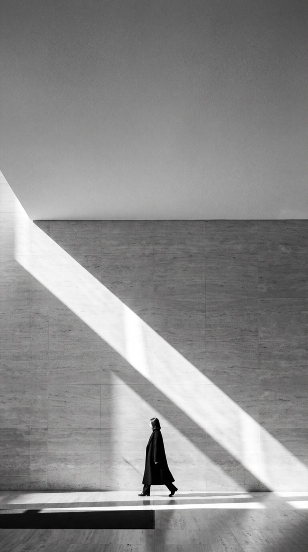
02
Hospitality. Ink on stone.
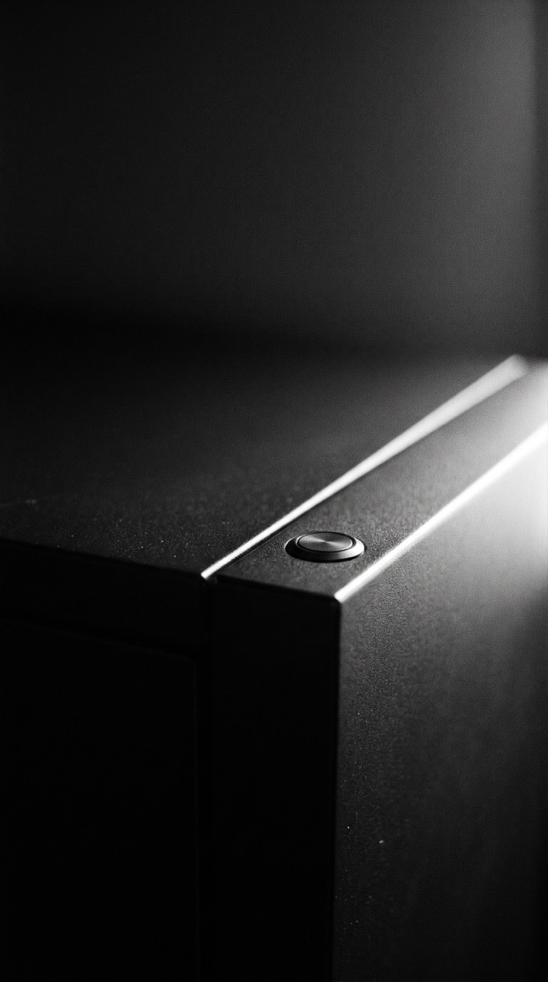
03
The machine. Paper on black.
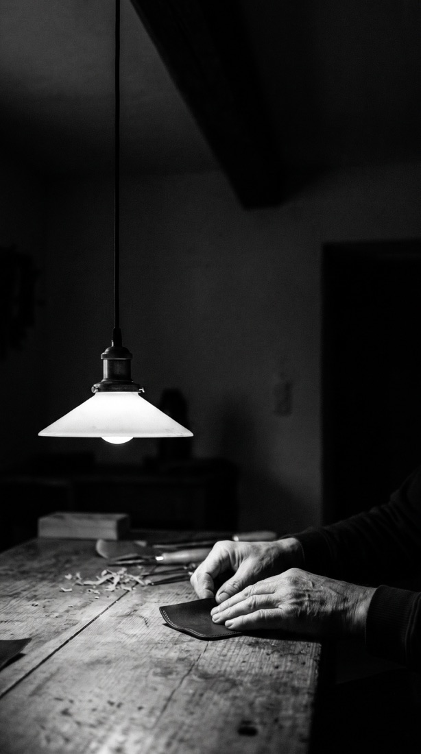
04
Craft. Paper in the shadow.

05
Office. Ink on the window light.
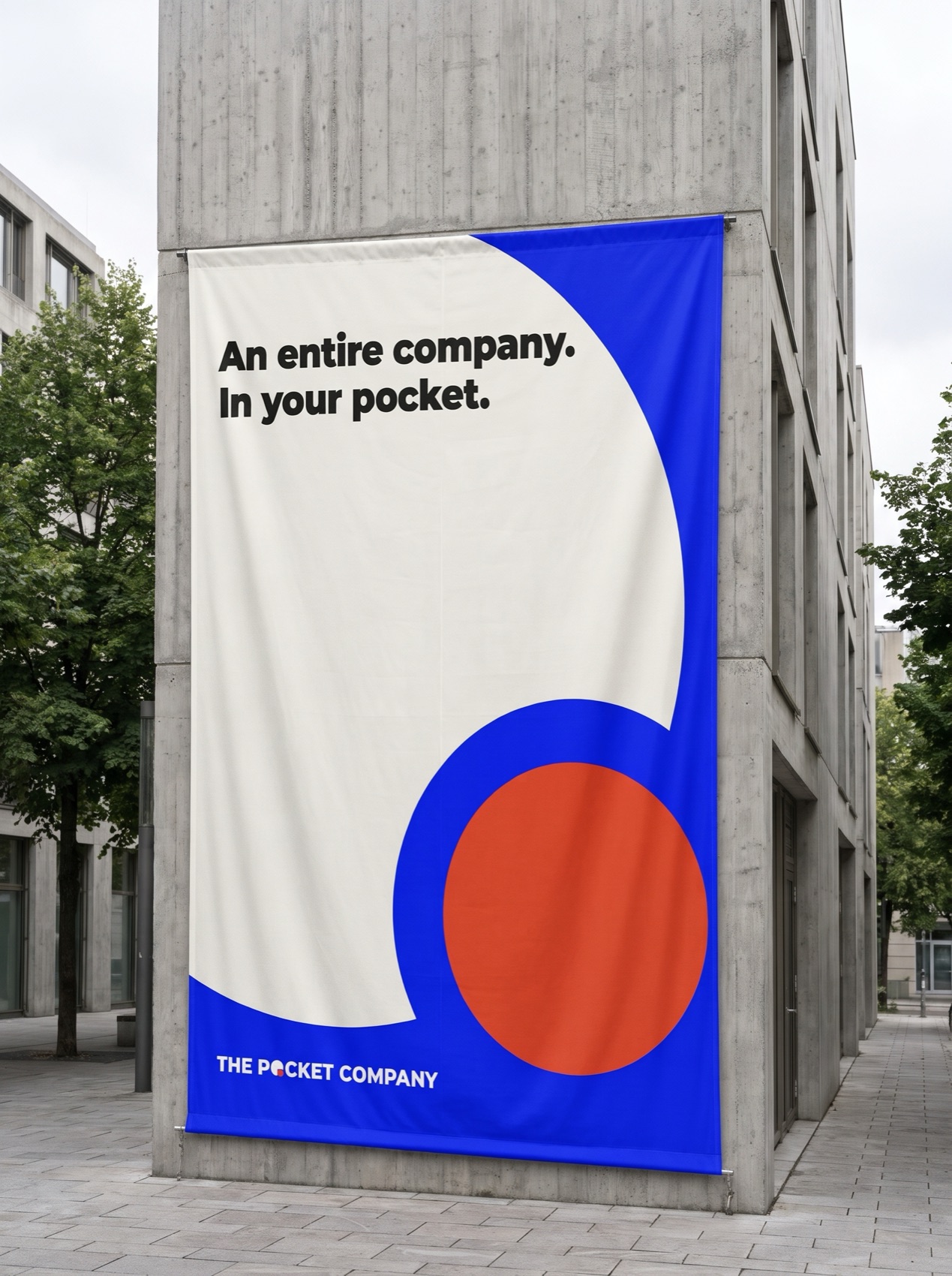
Fig. 6.27
Facade banner. The Cobalt poster at architectural scale.
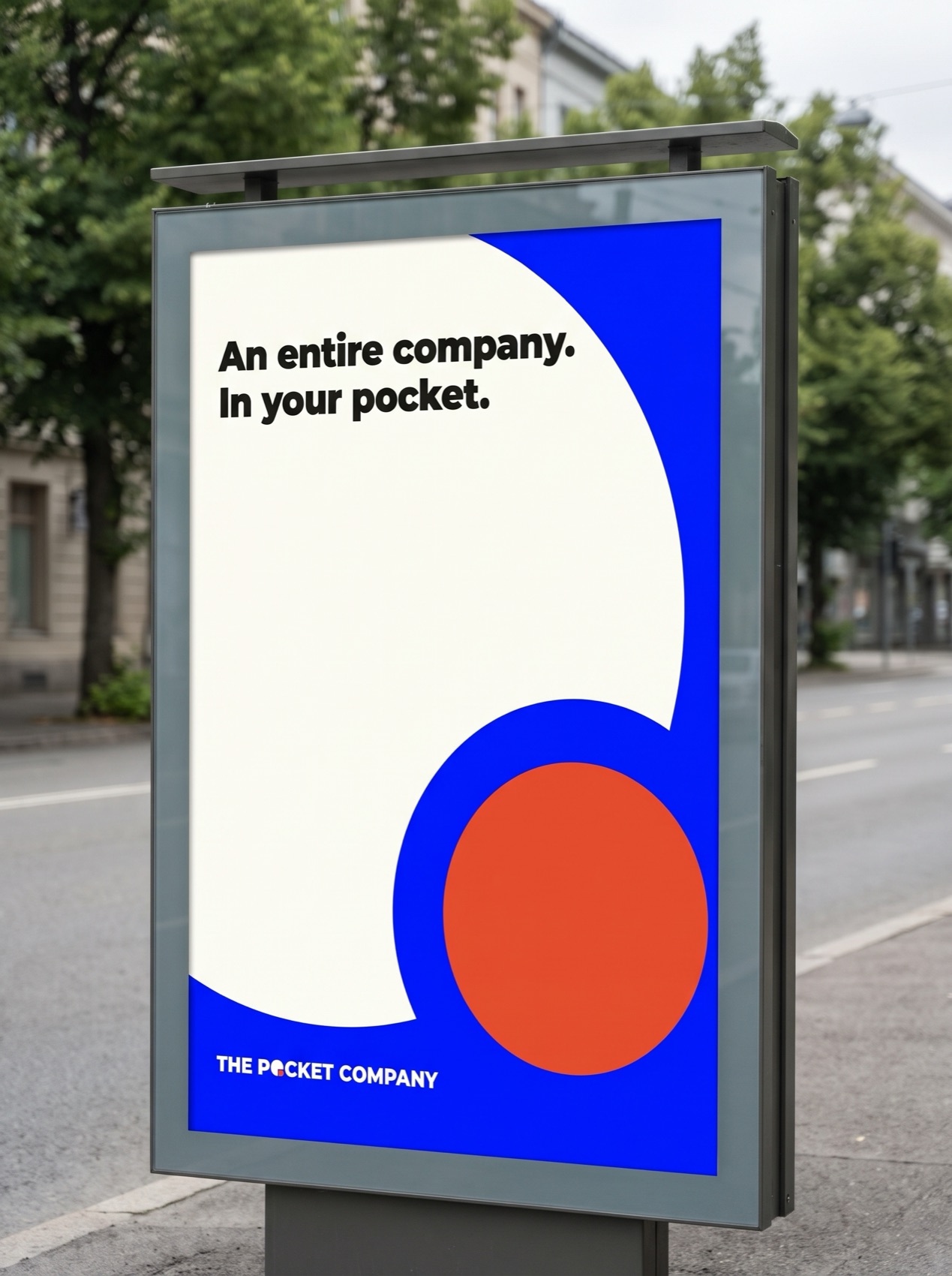
Fig. 6.28
Street poster. Same layout, same margins.
The big circle enters from the top left; the dot lands whole at the bottom right, at every size.

Fig. 6.29
Front elevation. Five agents inside, one Ember button.
| File | Use |
|---|---|
| tpc-logo-stack-* | Primary logo |
| tpc-logo-line-* | One-line logo |
| tpc-symbol-* | Symbol alone |
| …-positive · …-reverse | Full colour, for light or dark grounds |
| …-mono-ink · …-mono-paper | One colour: print, foil, deboss, thread |
SVG is the master; letters are outlined, so no font is needed. Transparent PNGs at 2000 px (primary), 3000 px (one-line) and 1024 px (symbol).
The Pocket Companythepocket.company
Small steps. Big moves.
Brand Identity Guidelines · Volume 2.0November 2026